As a B2C startup at an early stage, Rise is a small yet growing modern flexible work platform that connects millennial female professionals to flexible, remote, and distributed jobs in the US. Its vision is to build a world where every women can rise up, define her own path, and unlock her full potential. In the Rise community, each individual and her personal growth are appreciated the most. When I joined Rise as the first UX Designer, the founding team had its initial website set up alongside some visual components used for hero sections.
This project was focusing on integrating critical content of Rise with hierarchical structure, responsive visual presentation, and engaging calls-to-action on the website to help realize its vision of building a world where every women can rise up, define her own path, and unlock her full potential.
A redesigned informative website with consistent design across pages
Reusable visual components applied across digital, social media, offline activations, and branded swags
UX Research
UX Design
Prototyping
Visual Design & Branding
UX Design
Marketing Strategy
Copywriting
Sep 2019 – Dec 2019 while working on multiple projects
When I first joined Rise, the website was barely able to present the branding, the values and the vision that the company and the founding team has always wanted to realize. A new comprehensive well-designed website and branding system were in high, immediate demand for Rise to provide more engaging environment for its current users and to grow upon its potential audience in the long term.
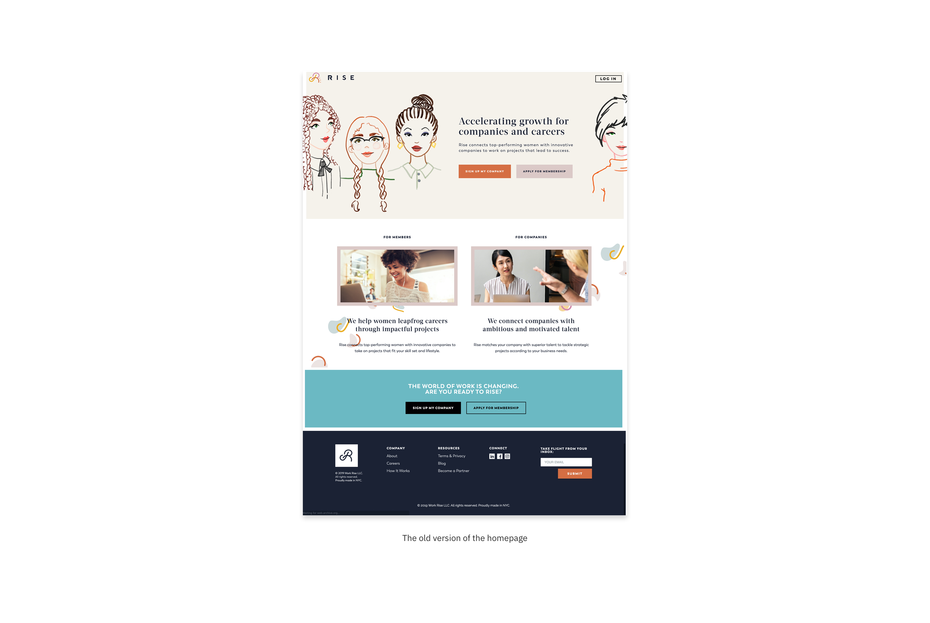
At the moment, the team has already created a branding book including logos, color palette, typefaces and some illustrations. The branding looked way too feminine and “fashion-ish” yet not fully agreed with its mission to empower entrepreneurial women.
The initial website was lack of essential information about the company, the values it was dedicated to and the benefits it was aiming to provide to the community.
There was no consistent design cross the sites. Information were messy and difficult to follow.
Utilizing the current color palette with different portions for each
Scaling up the font size difference for paragraph styles
Adding more copywriting aligned with the company’s mission and vision
Creating illustrations and icons
Adding photography for trust building
Creating hierarchy for readability
Optimizing the navigation
Adding calls-to-action to increase engagement and interaction with users
Given the challenge that we had to keep the muses and most of the visual components in our redesign, I did research on other platforms in the industry and studied their practices looking for some inspirations.
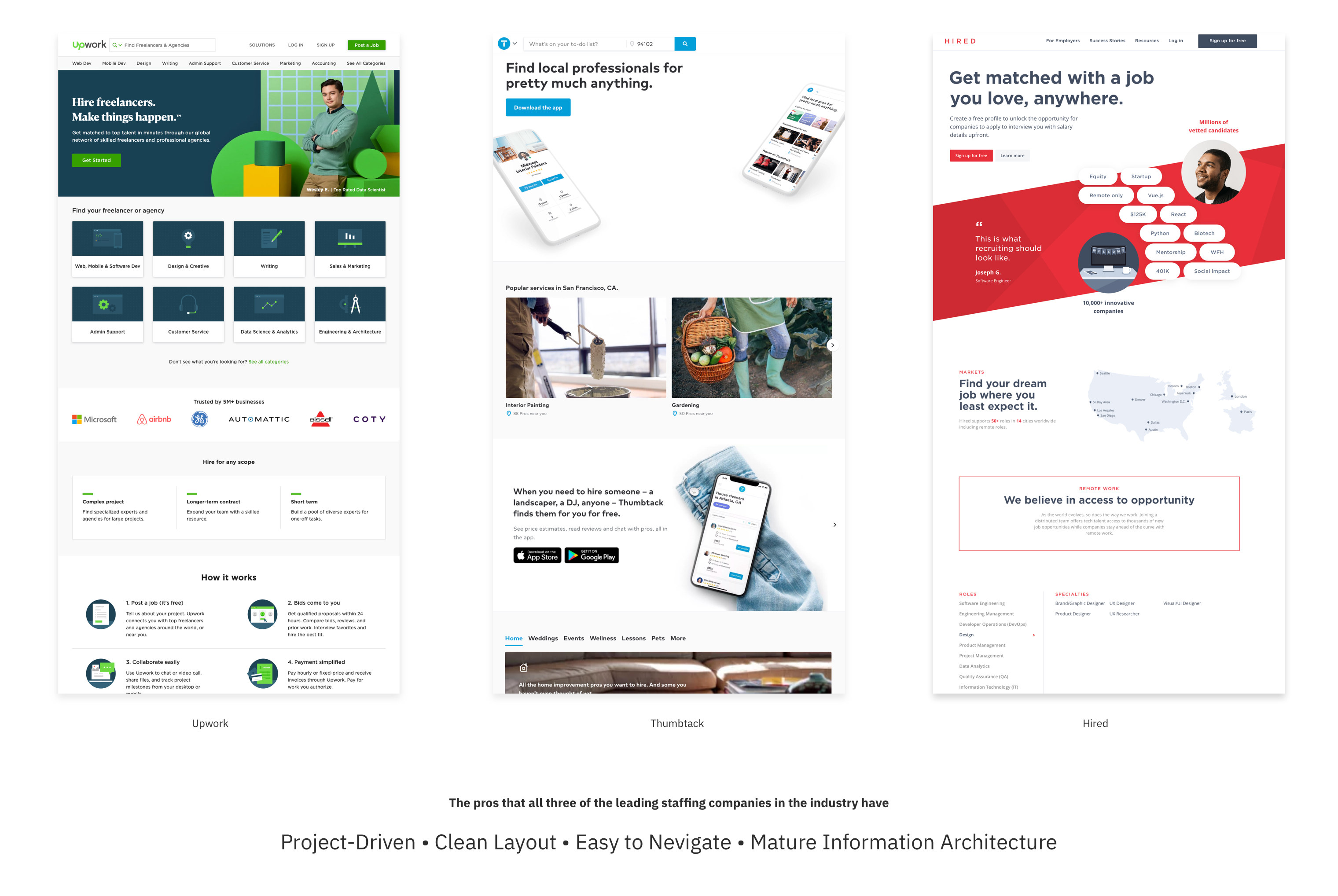
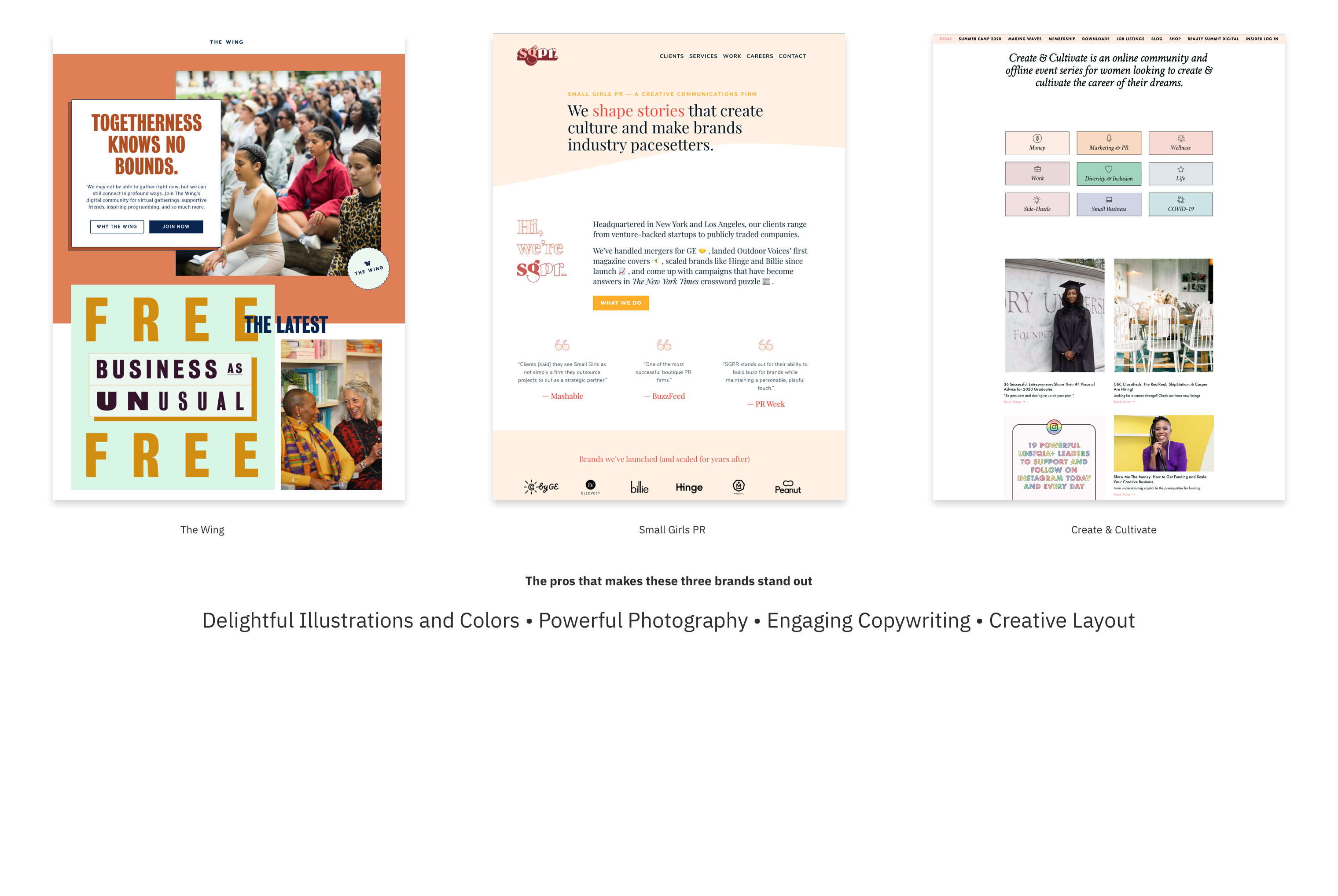

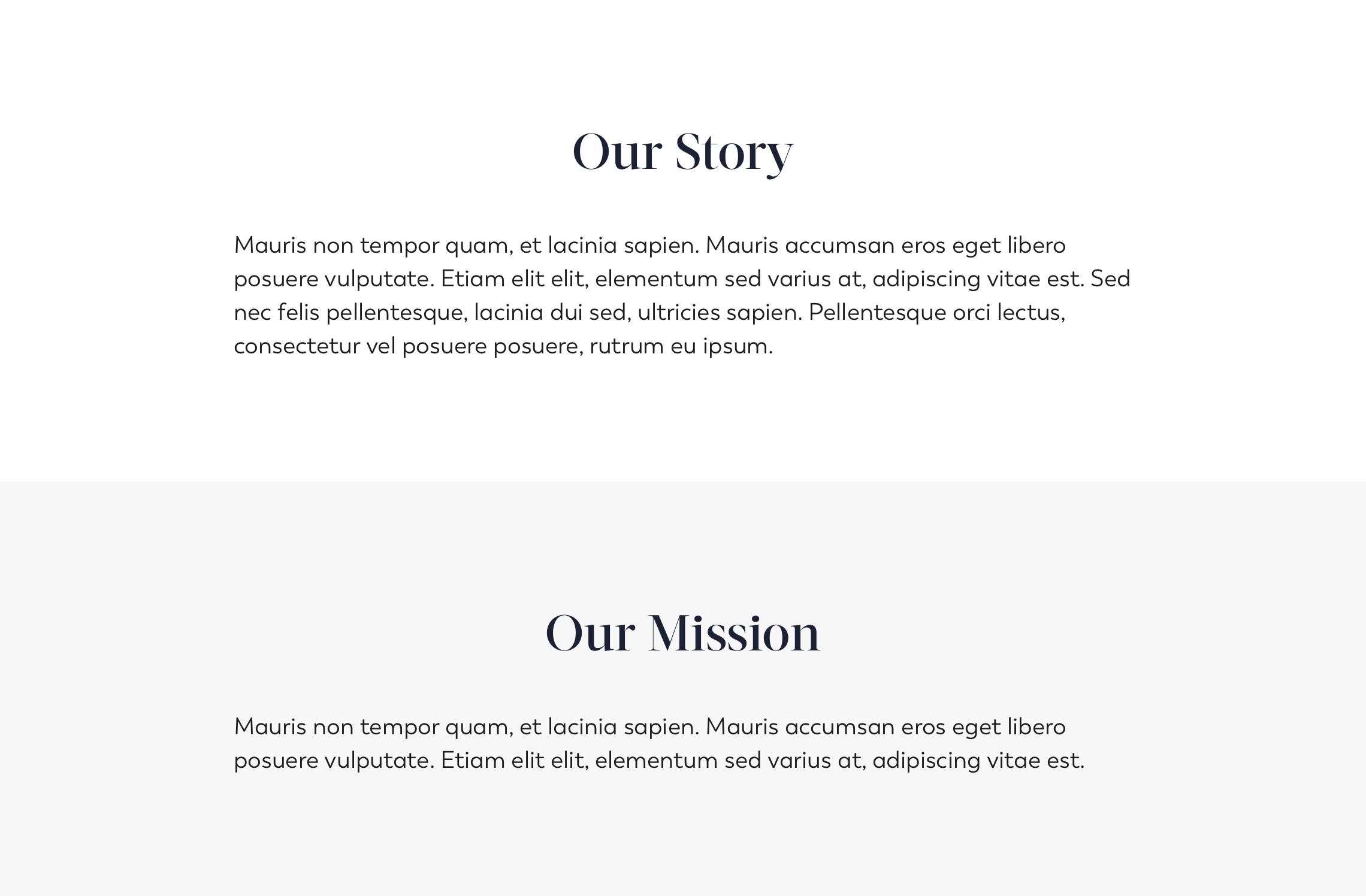
Initially I wanted to work around with a basic arrangement for each "building block" as it is the easiest and most straightforward method to delivery chunks of information with relatively a clean layout. However, it had the tendency to be way too plain, boring and lack of unique branding style, which was not ideal to bring up exicitement for audience.
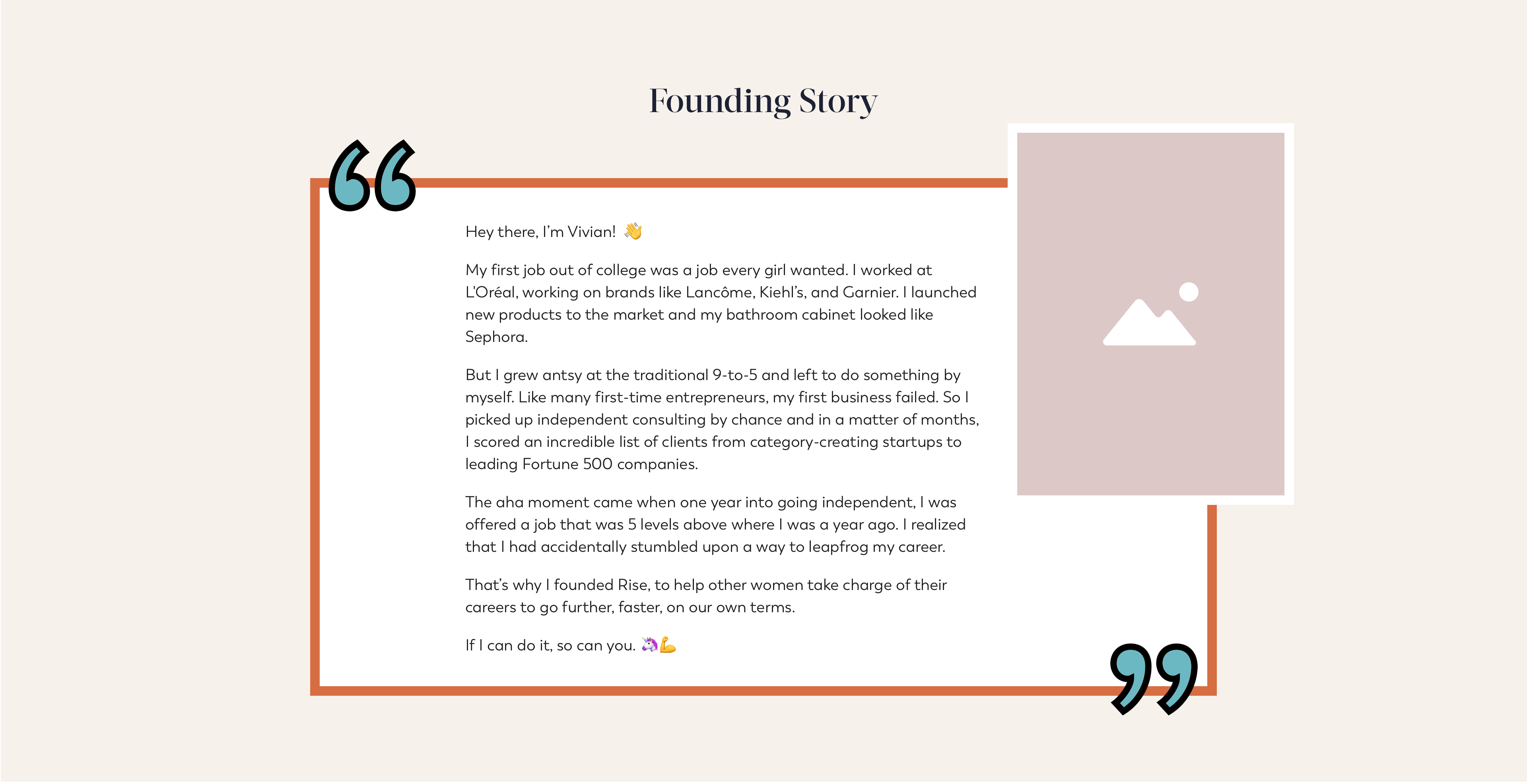
Nothing sounds more interesting than real-life stories, especially when it is a story full of twists and advantures about "what, why, who, where and how". Telling the down-to-earth founding history makes the brand more trustworthy and relatable.
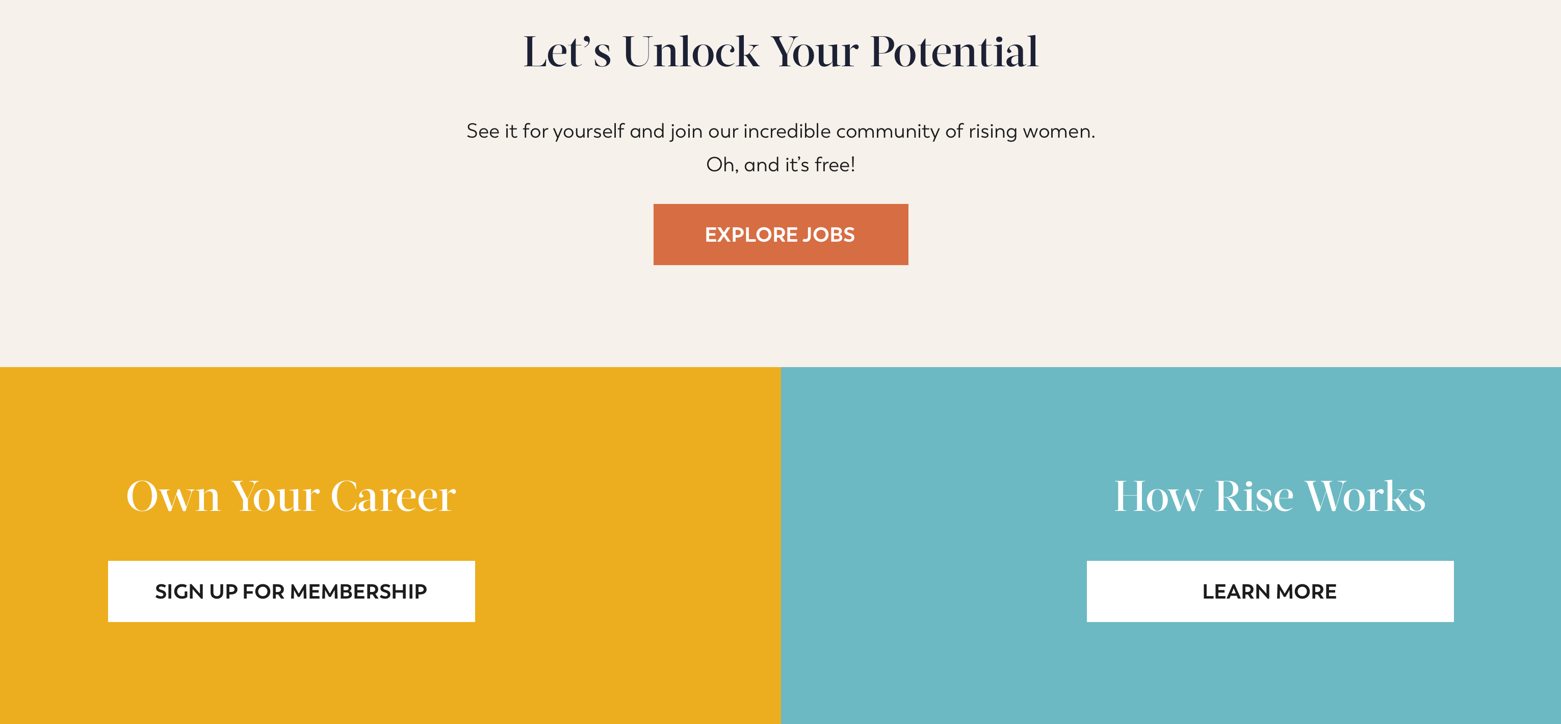
The easier and faster a user is able to access a call-to-action button, the more likely they would keep exploring and stay active. Therefore, right after addressing the history, the cultures, and the values Rise represents, the instruction for next step is essential to guide and encourage them to be more engaged.
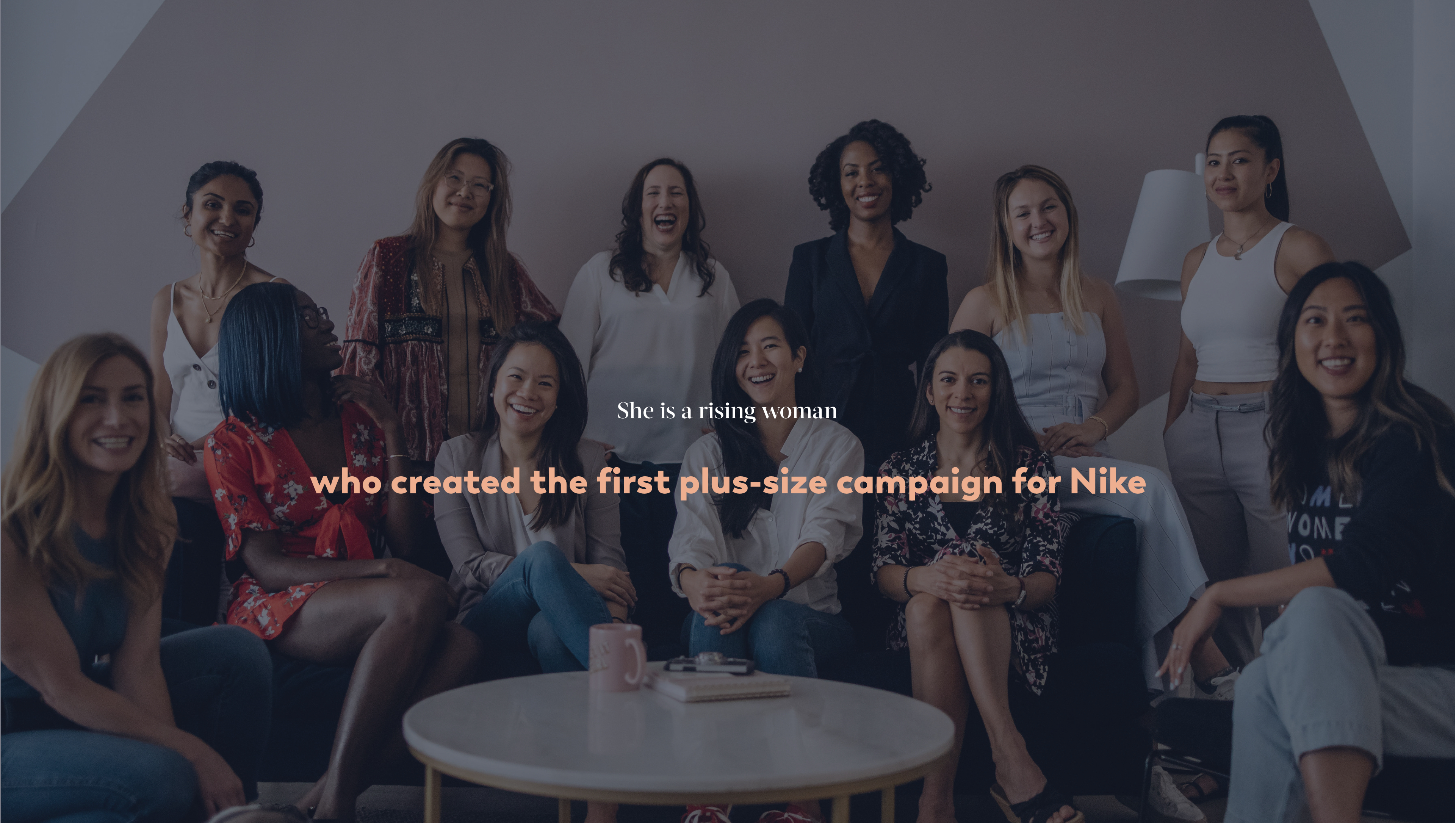
For a website, the utilization of the limited space is a priority. The collaboration between a photo and text effect displays more content and creates fun experience without being distractive.
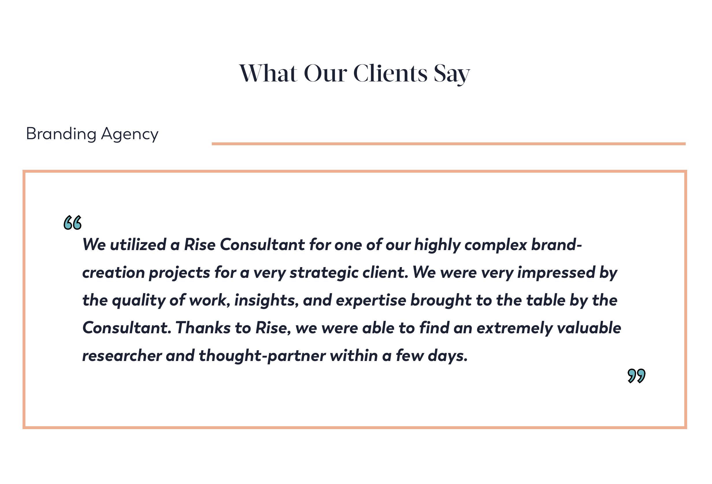
Direct quotes of comments and feedback from our successful case studies in different industries help us earn trust from potential audience.
My colleague Carlene, the other designer at Rise was responsible for the homepage redesign. We first worked together to finalize the the strategies and solutions we were going to apply across pages to make sure the design was consistent and unified.
The founder of Rise, Vivian, was in charge of the copywriting and makerting strategy. Working along with her and the rest of the team, we finally came up with interesting stories and content for the website to be more relatable and engaging to our audience.
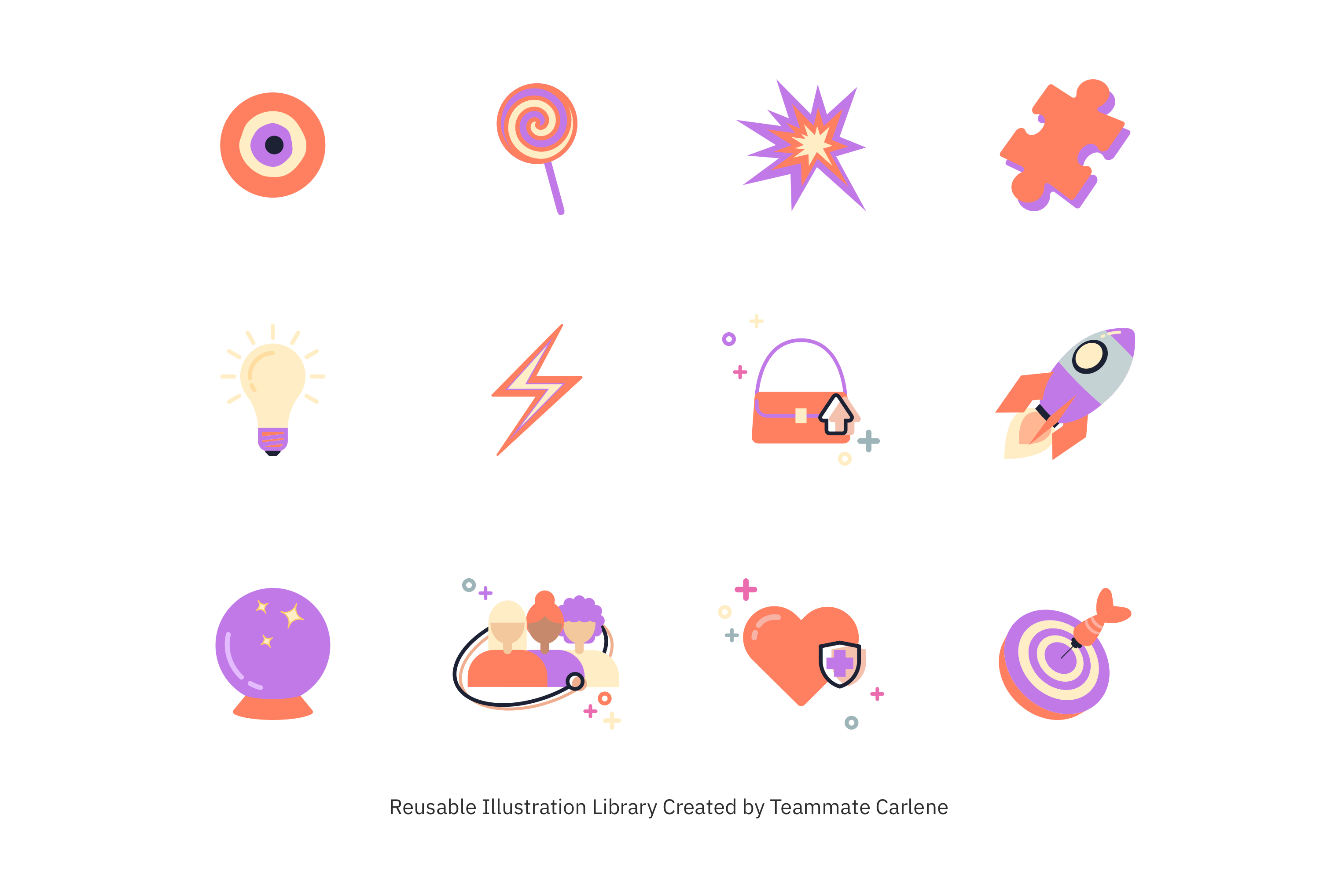
Carlene took most of the responsibility for the visual creation, and she designed a series of illustrations and icons, which have been using since then for not only the website, but also on social media and offline activations.
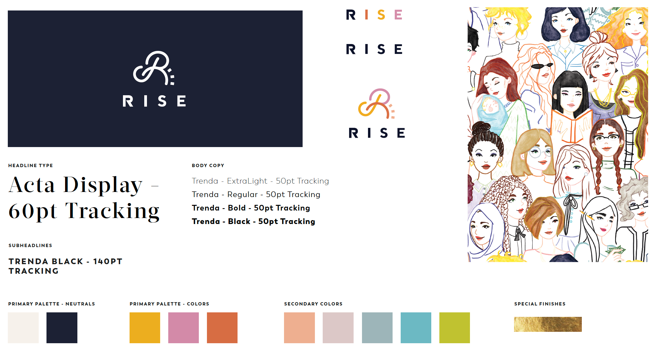
The new branding styleguide was based on the last version. We only made a few changes given the time limit trying to iterate the new version of the webiste to a modern yet systematic style.
Bold illustrations in large scale, information for both hiring companies and individual professionals to get on board, powerful photography and great partnerships to let audience know better about Rise in just a minute.
More details about the founding history and the future of Rise.
Clean layout and systematic information of the Rise community.
Given the time limit for this project, we were not able to completely redesign our branding. The new version of the website works perfectly fine, and we've received lots of positive feedback from our users and the companies we've partnered with. Yet the branding does not stand out strong enough to support the design for our next version of the product. I'd love to explore more on this.
Create interactive elements that would draw more attention from the potential audience and guide them to the signup process.
Initiate a few rounds of testing and interviews with our current user groups and potential audience as a start for a more fun, interesting onboarding experience than just filling up a form.