This project focuses on encouraging people to organize food storage, reduce food waste, and increase the awareness of sustainability. The project started with a non-profit topic of simply drawing more attention to the problem of food waste. Later during the design, based on my research and testings, I twisted the solutions, added for-profit concepts and more material benefits to motivate users to reduce food waste.
UX Research
UX Design
Prototyping & Testing
Visual Design & Branding
Although we know the negative impact of food waste, lack of movitation stops a lot of us take actions to actually participate in the food saving campaign. In addressing issues of food security and sustainability, agricultural production has garnered considerable attention, but food spoilage and storagehave received much less attention. Also, different types of food require different methods and places to store. Freezer, refrigerator, pantry and counter are the most common places to store food. People also get used to keep food in their bedrooms and even anyplace that is close to them at the moment.

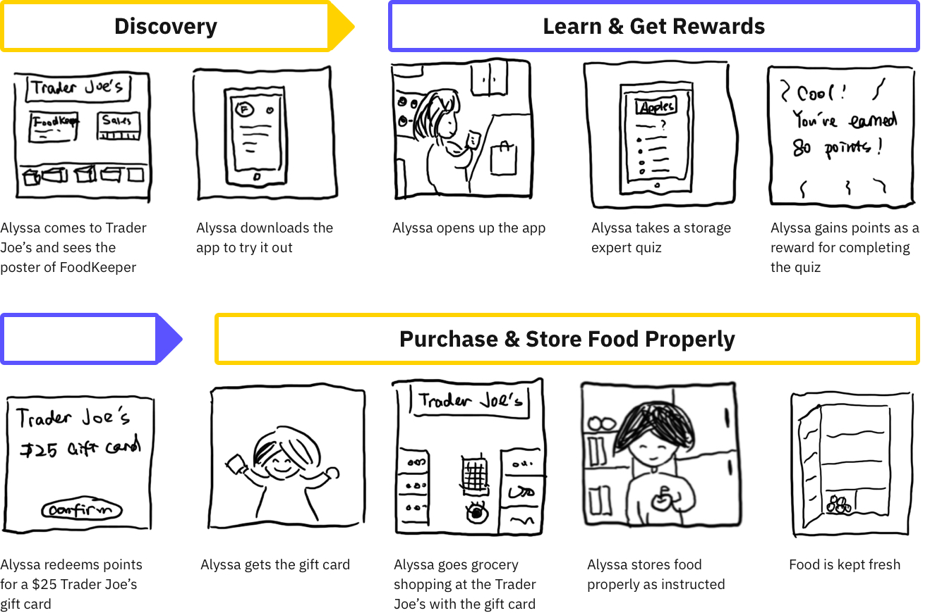
Learn about food storage from guideline, quiz practices and challenges and earn points as rewards. Redeem rewards points into supermarket gift cards. And keep doing it!

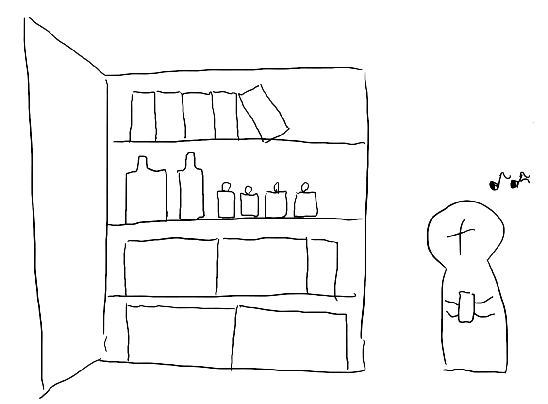
Based on the interviews, older people are most likely to have already developed way more experience with food management, and they show less interests in spending time reading and following instructions and changing their habits even if there were some better ways to do it.
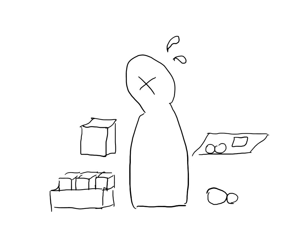
For this proejct, I focused on the young generations who just started to live off on their owns, have less experience with food management and have a strict budget limit for grocery shopping. It is easier to draw their attention and encourage them to take actions once there is practical motivation involved.
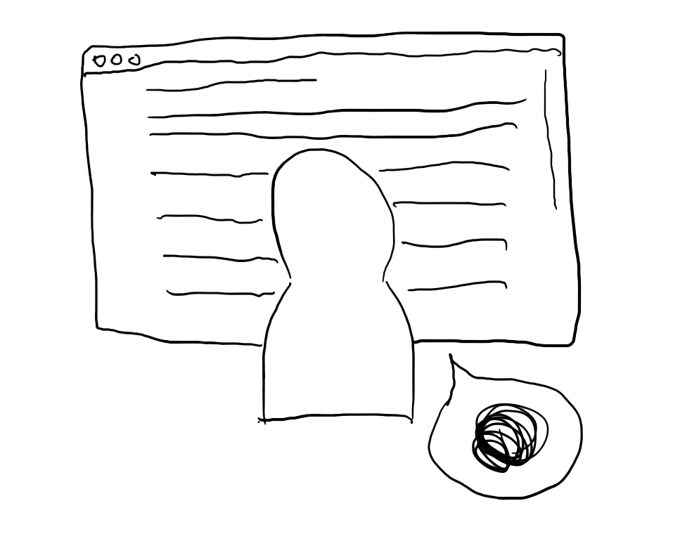
Most of the sources providing food management information are websites, and of which some are from non-profit organizations. They usually are full of content, yet people get bored easily and don’t want to stay on the sites for too long.
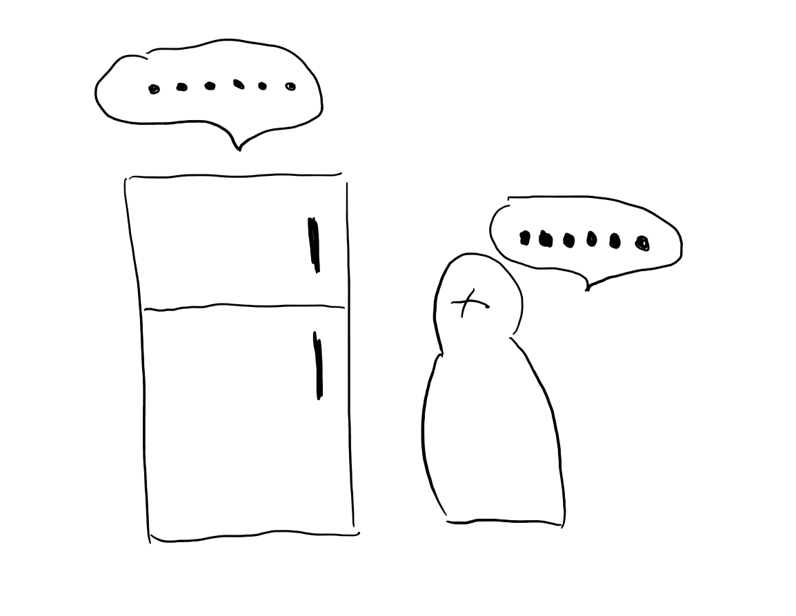
Imagine you put your toast breads in the freezer, which technically is the best place to store them. Then what? Nothing. You might find it taste the same as you put it in the pantry. Less tangible benefits makes people less motivated to follow the right methods.
A design solution providing systemic guideline of food storage and a rewarding system as motivation. The mobile application is only a part of the solution, and I’m aware of the non-digital components for the food saving process.
26 | San Francisco, CA
UX Designer
Teresa works for a start-up company. She has a busy schedule, and goes on business trips a lot. Asides from work, she cooks and also likes to try new restaurants out. She cares about sustainability and health.
Too busy to read wordy instructions on food storage
Lack of motivation to keep reducing food spoilage
19 | Berkeley, CA
Sophomore at UC Berkeley
Alyssa just moved out to her new apartment. She is excited to start off living on her own for the first time. She loves food and wants to learn how to cook while she doesn’t have too much money to spoil herself.
Limited budget on food shopping
Limited space in the apartment to store food
31 | New York City, NY
Mechanician
Chris loves sandwiches and beers and used to eat a lot of fast food. He started to change his diet and workout for a better lifestyle. He used to not care about food, now he wants to learn more.
Unhealthy eating habits
Most of the healthy food is perishable
Click on the image to enlarge it
Click on the image to enlarge it

Click on the image to enlarge it
Click on the image to enlarge it
Click on the image to enlarge it
I conducted two rounds of user testing. For the first round of user testing, I was focusing on feasibility of the solution and usability of the mid-fidelity prototypes. I tested it out with three potential users in this phase and got challenged on the solution and design of the prototype. Based on the feedback I got from the testers, I made adjustments on the content, layout and hierachy of information. Then I developed hi-fidelity wireframes for another round of testing.
Organized structure and hierachy for storage insturction is needed when the content is in big chunks

Interaction and confirmation of finishing up the instructions, quizes and redeeming process are important for users to follow up

Little freedom and controls on the hint gathering for users is overwhelming and decreases their motivation
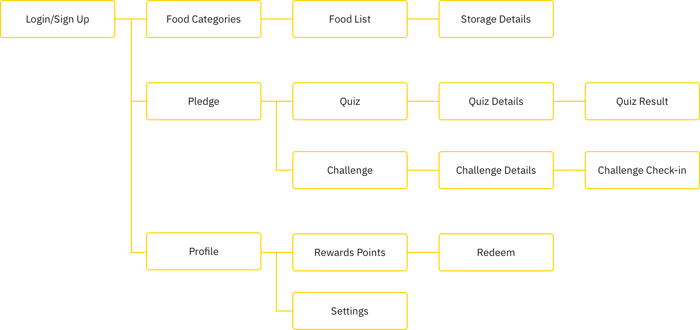
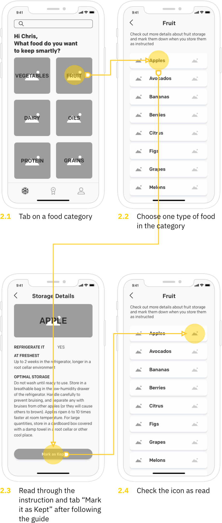
By tapping on the category of food, users are able to look through all kinds of food and check out the detailed storage guideline for a specific type of food. The guideline is layouted with clear and organized structure for reading.
By tapping on “WHERE IS MY FOOD AT”, users are able to take a knowledge quiz about food storage. Users can get hints if they need, and based on the results, users will get certain points as a reward for their time and interest in food saving and storage.
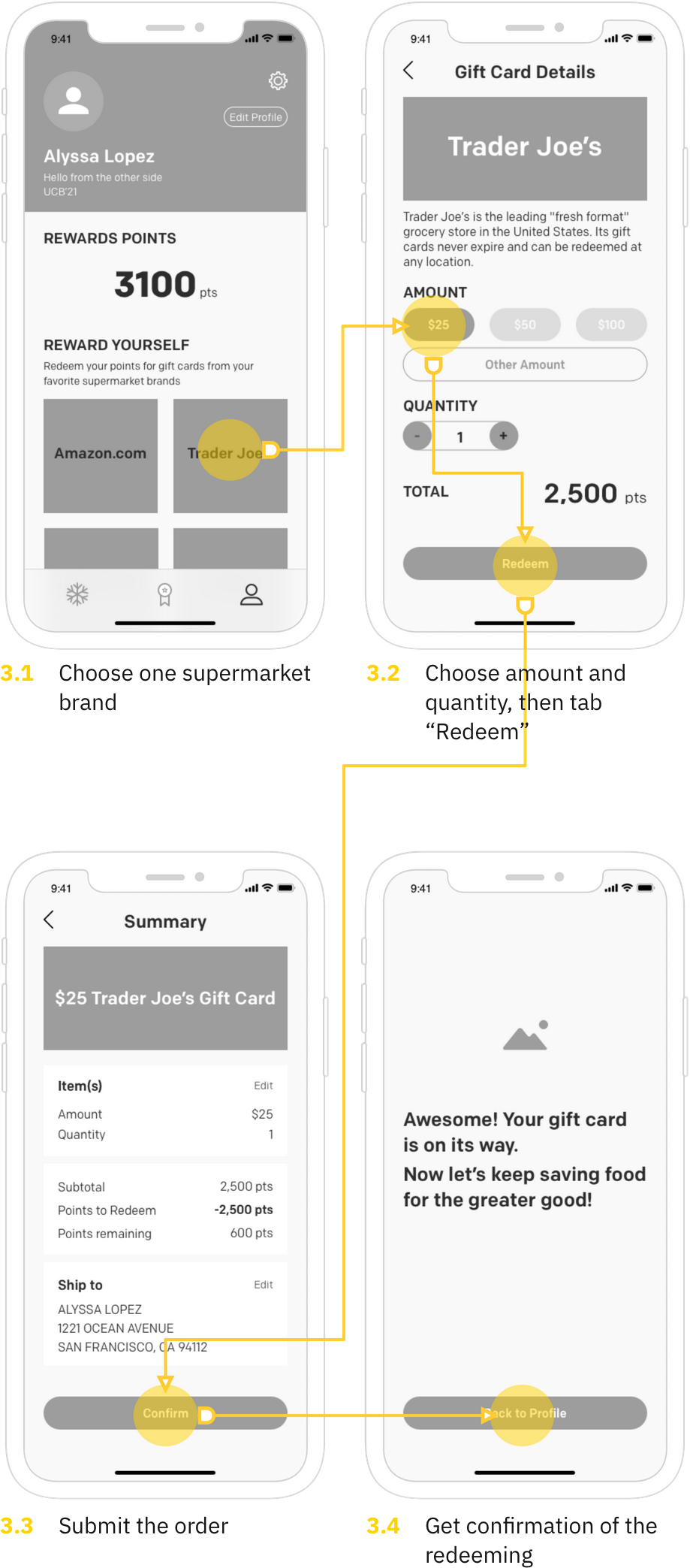
Users can go to their profile page to check their total rewards points available and explore if there is any supermarket they are interested in. By tapping on a certain supermarket brand, users can choose the amount and the number of gift card(s) they want to redeem for. Then they can proceed the order and wait for the gift card arrives in a few business days.
Develop the user flows and wireframes for Challenges during Phase 2
Initiate more user testings and interations, focusing on not only the usability of the mobile app, but also the feasiblity of the solution–if users actually follow the instructions and store food properly
Develop a detailed business plan for the collaboration with supermarket brands