Restaurant Rebranding
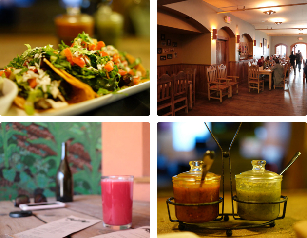
This project focused on brand redesign for a local restaurant located in the Mission District in San Francisco. I went to the restaurant for a few times to observe and try out its food, services and overall design before actually digging into my redesign process.
The food there was amazing! However, the rustic design of the restaurant owned at the time was inconsistent with its mission of bringing love to the community with its fresh and organic cuisine and its family-friendly environment. Therefore, I decided to come up with a redesign solution with more delightful, energetic and fresh details.
UI Design
Visual Design
Branding
Research
Gracias Madre is a Mexican restaurant located in the Mission District in San Francisco.
It intends to bring consciousness in the community to the importance of sustainability and of consuming locally grown organic food with the emphasis it places on the sourcing of its food.
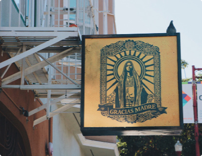
The restaurant has a delicated black-outlined portrait of Mary, mother of Jesus, as its logo and its sign in a musturdy background. It was difficult to be recognized from a distance.
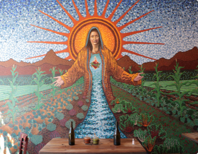
The restaurant has a colorful and appealing mural on its wall yet the rest of it is rustic and rough. It is difficult to associate the design with their statement of “our mission is love”.
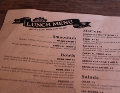
Due to the complexity of its logo, the restaurant simplies it and only keeps the ribbon part for its menu design. However, the design is not strong enough to differentiate the restaurant among its competitors in the Mission District.
A simply but powerful logo implied the portrait of Mary and its idea of bringing organic Mexican food is needed.
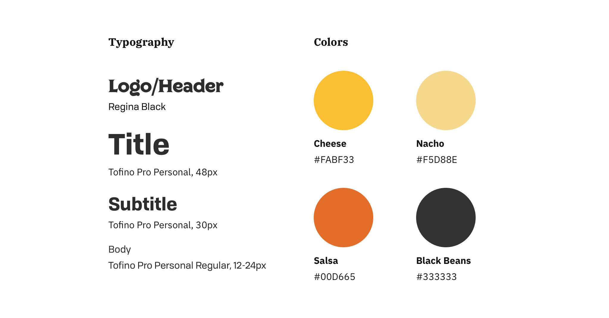
Develop a design kit for its logo, menus and other branding products with the same style.
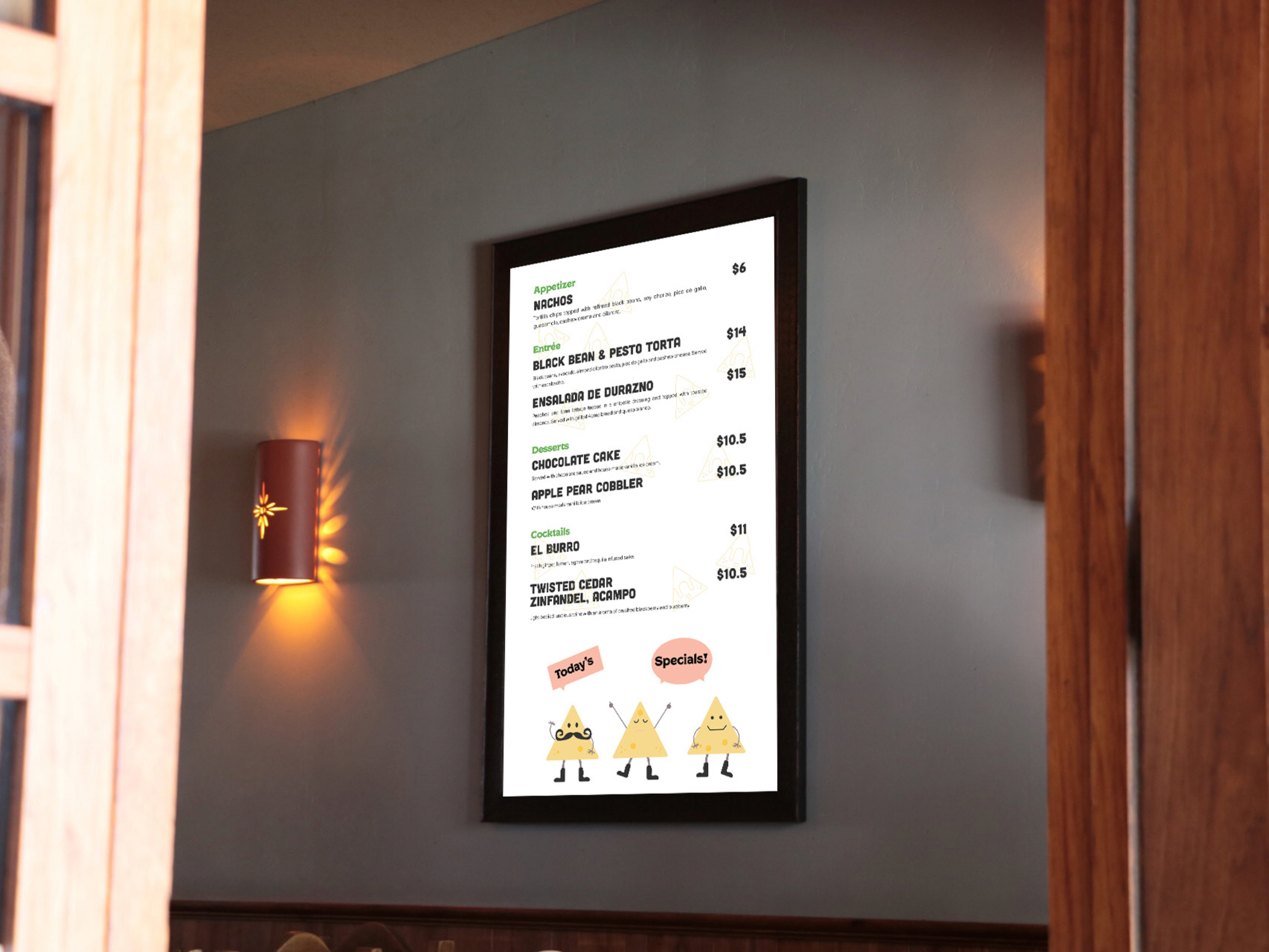
Brings more colors, fresh and energetic elements into the design kit, as well as interactive product on display.
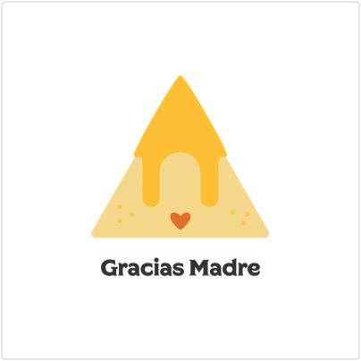
Full-color Light Logo

Full-color Dark Logo
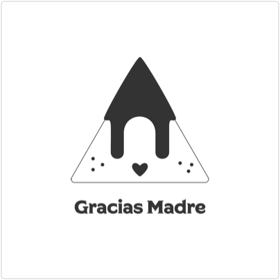
Monochrome Logo
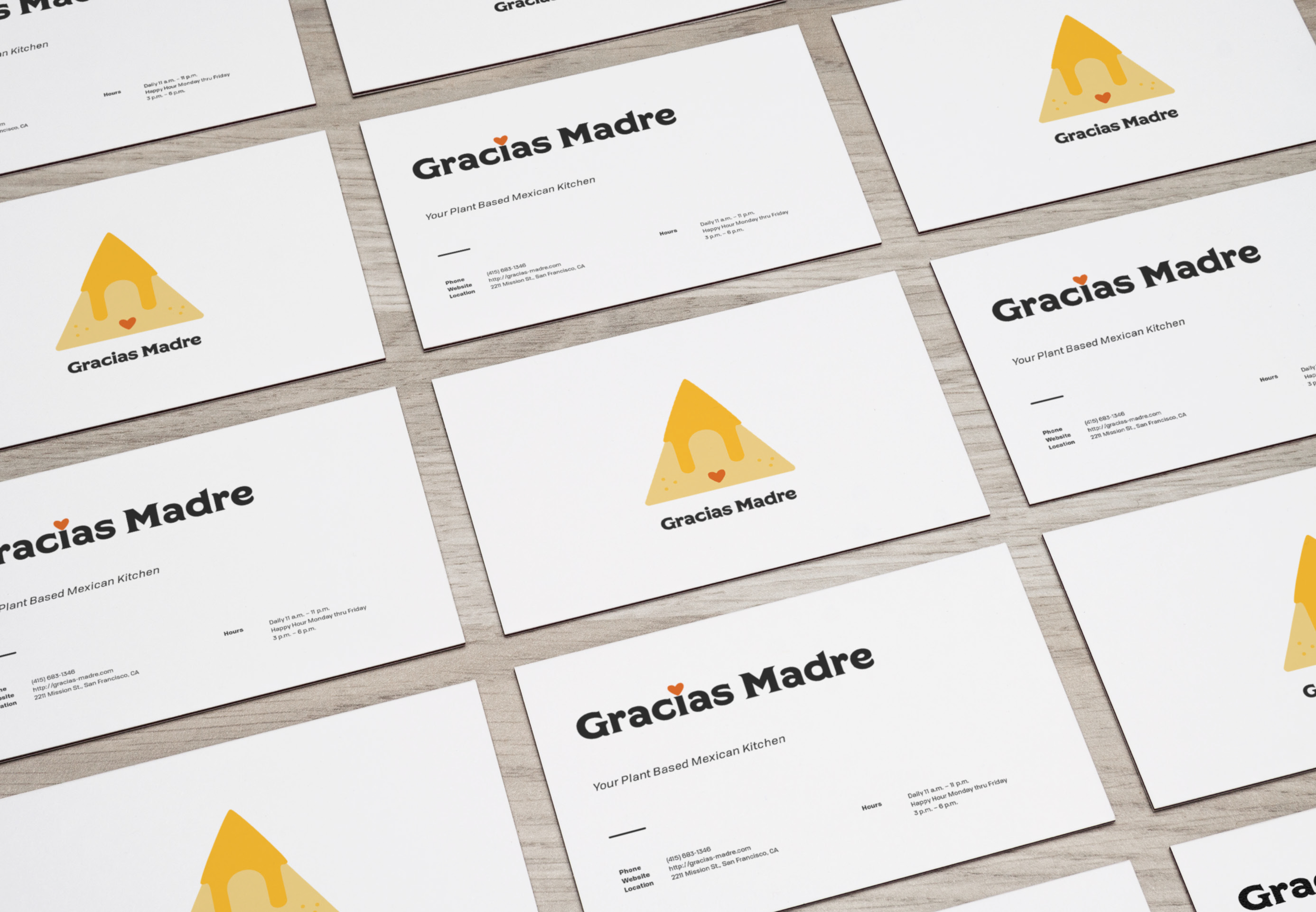
Click on the image to enlarge it
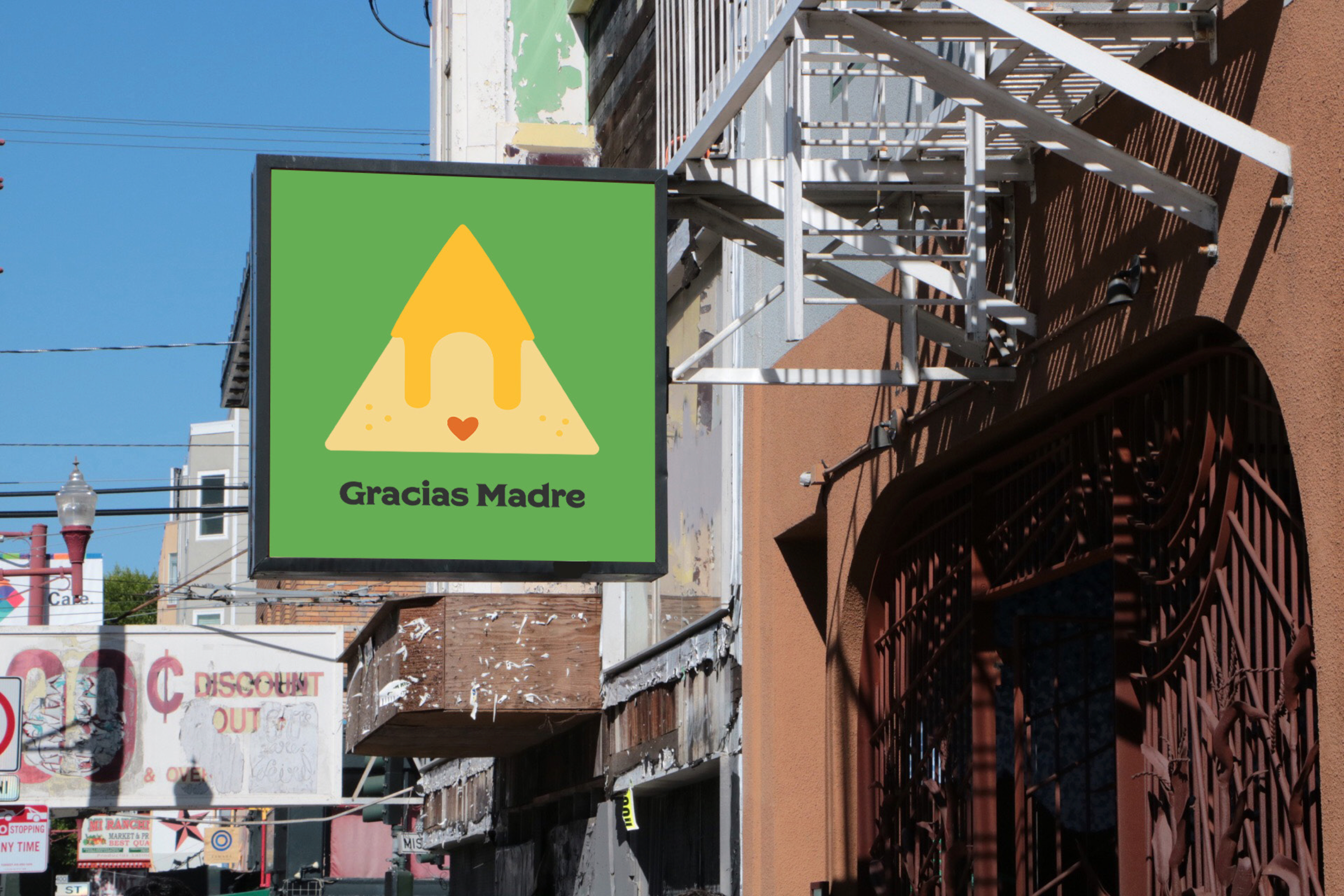
Click on the image to enlarge it
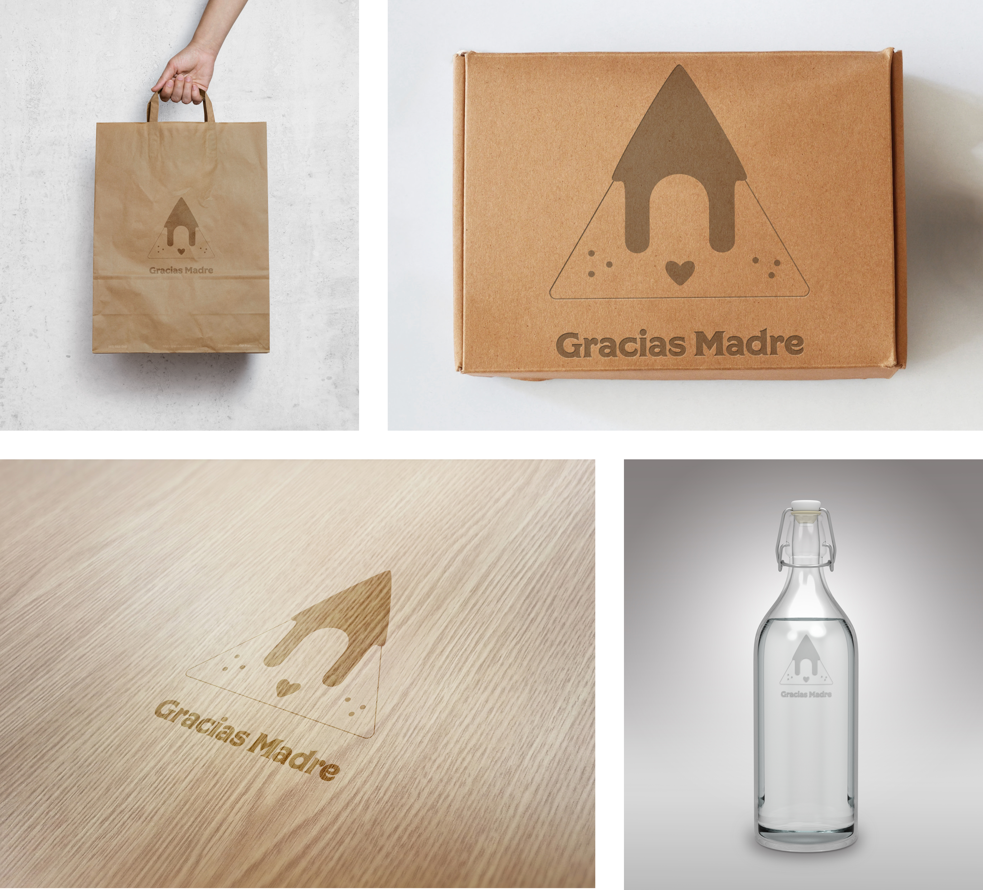
Click on the image to enlarge it
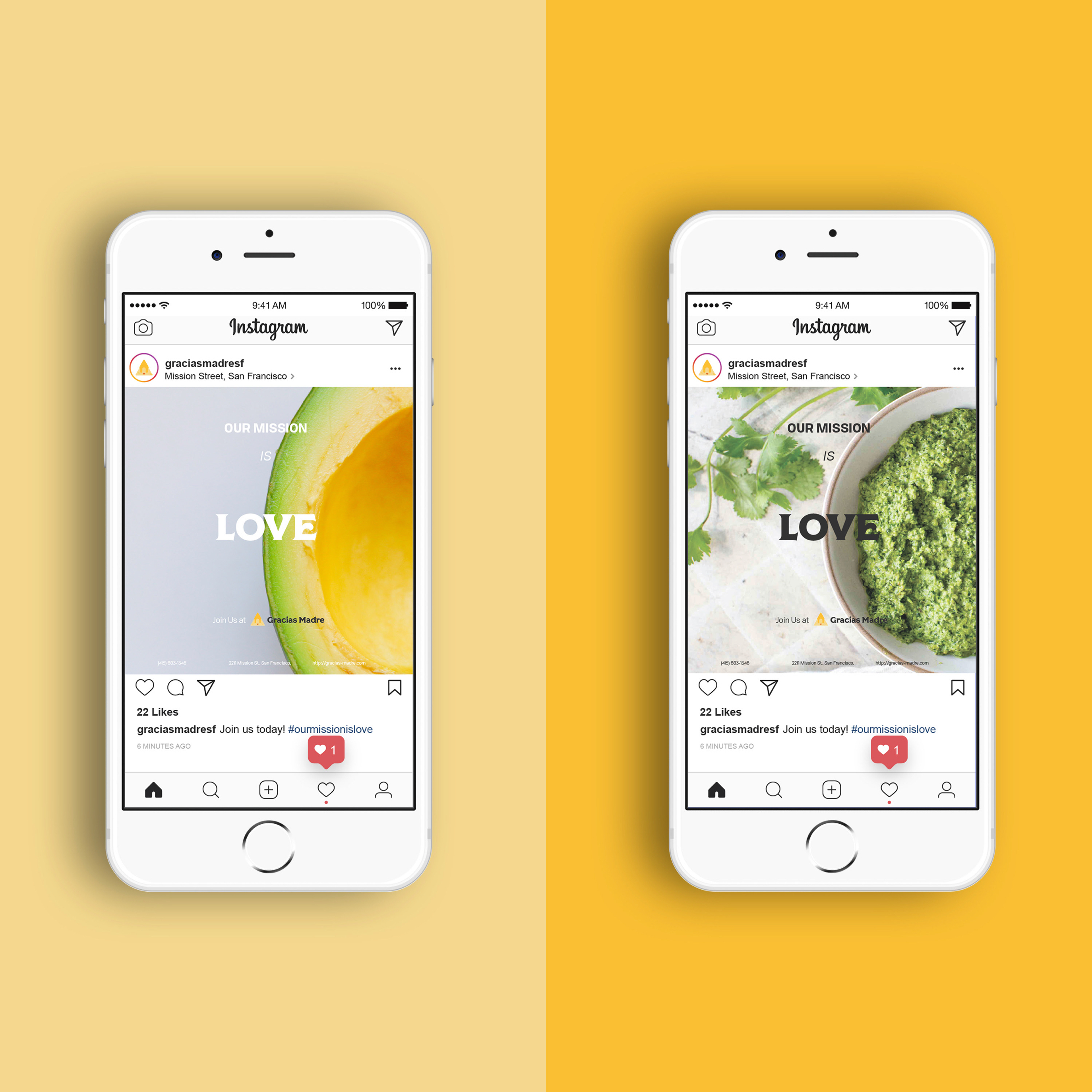
Click on the image to enlarge it
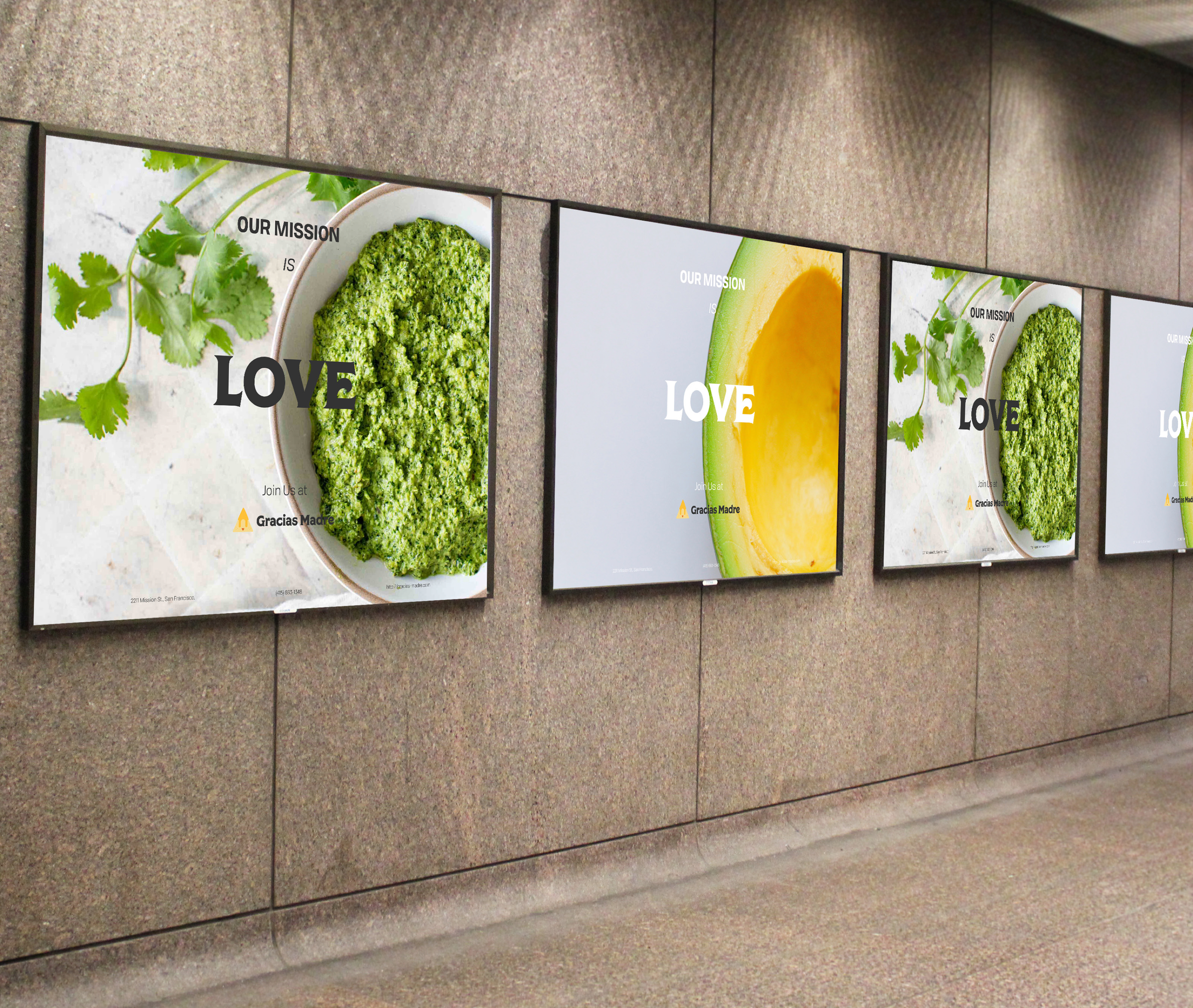
Click on the image to enlarge it
Click on the image to enlarge it
Gracias Madre was my first rebranding and design project ever. It was the start of my career as a designer. It helped me explore the world of visual design and design tools.
When I looked back at this project, I realized how much I have improved on my design skills. If given more time, I would love to refine my design for its website and the interactive menu on tablets.