Guide you to the right place in no time
FunSpot is a mobile event platform providing real-time locaking tracking, fee split, event creating and interpersonal communications to people who love social events and networking with others.
UX Research
UX Design
Prototyping & Testing
Mobile Application Design
People have been struggling for years in big events, such as concerts, music festivals and sports games, trying to keep in touch with their friends while still having a good time. People have found it really upsetting and time consuming when they try to purchase tickets for some popular events as a group and split the payment with friends. If they buy tickets separately, sometimes the tickets are all sold out too quickly that someone in the group cannot get one.
An event hosting and ticket purchasing platform where users can achieve real-time location tracking, multi-option payment split and interpersonal communication on their daily basis when they enjoy social life in communities.

An event management platform for people to participate and/or host events for people with same interests

A platform for people to meet up with others who have the same interests and hobbies

A mobile application that is developed by Facebook to check out local events
20 | Senior at college
B.S. in Business
Los Angeles, CA
Inviting people to a event individually is time consuming
Collecting and splitting fares is complex
Hard to find people in a big crowd
Go to concerts with friends
Meet up with friends easily during a concert
Separate fees
27 | Composer
Chicago, IL
Inviting people to a event individually is time consuming
Collecting and splitting fares is complex
Explore interesting events
Meet up with new friends
Communicate with people online

Click on the image to enlarge it
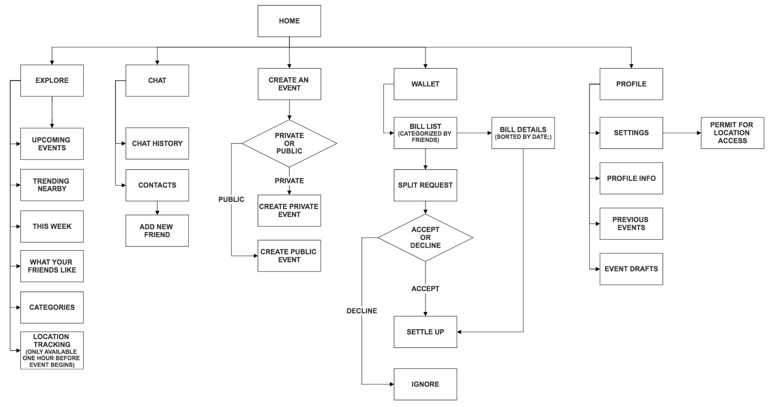
The real-time location tracking will be activated automatically 60 minutes before the even starts.
Users can check out event details (host, location, date, descriptions, and prices) and purchase tickets if they find something interesting.
If users decide to purchase ticket for a group, they can split the fees right after the purchase as the methods they want to separate.
Users can settle up their balance in the Wallet.
FunSpot was the first UX design project I ever did. It initiated my journey as a UX designer. Through the project, I progressively developed a better understanding about UX design process and design thinking.
I learned that the principles of UX design is a great reference to evaluate a product. Also, usability matters a lot for a product. I tried to integrate too many features into one app. However, later on I realized that would make the solutions way too complicated, far away from my initial ideation and very difficult to use. Simplicity seems like a easy job yet it requires a ton of research, testings and iterations.
I would like to reshape the design question and only focus on designing for location tracking. In addition, more user testing and iterations need to be conducted.